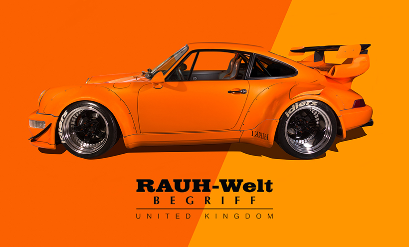
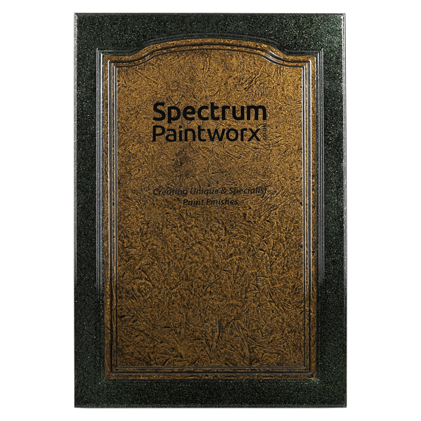
It’s all about colour at Spectrum Paintworx

Spectrum Paintworx are well known in Sittingbourne for the fabulous paint finishes they do on cars and bikes, however this is such a small sector where these finishes can be applied. From shop signage, display stands, mannequins to barrier posts there is so much more scope for this work and this is one of the reasons Paul asked me to come on board to take the brand forward.

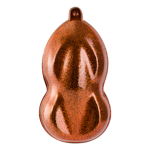
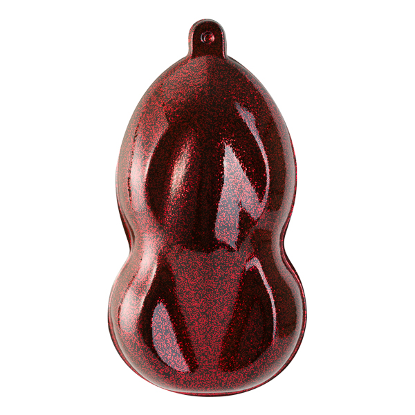
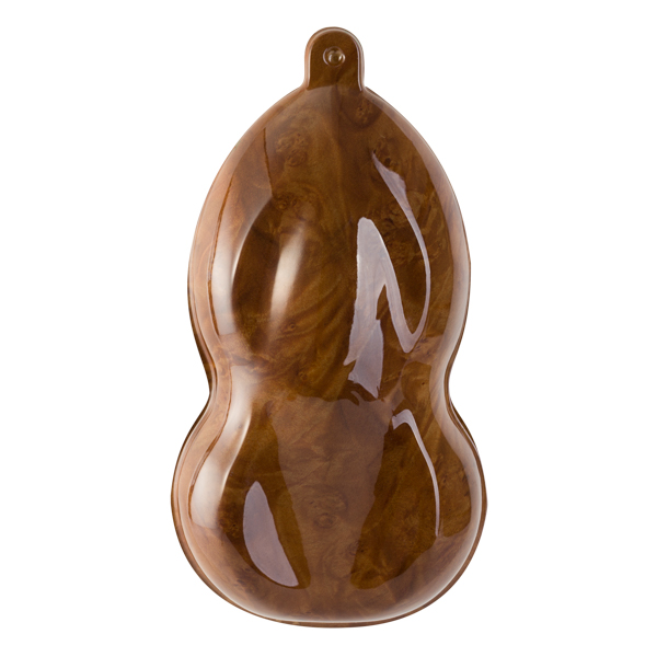
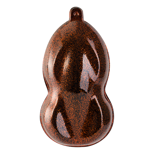
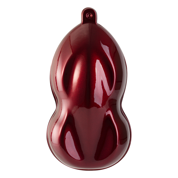
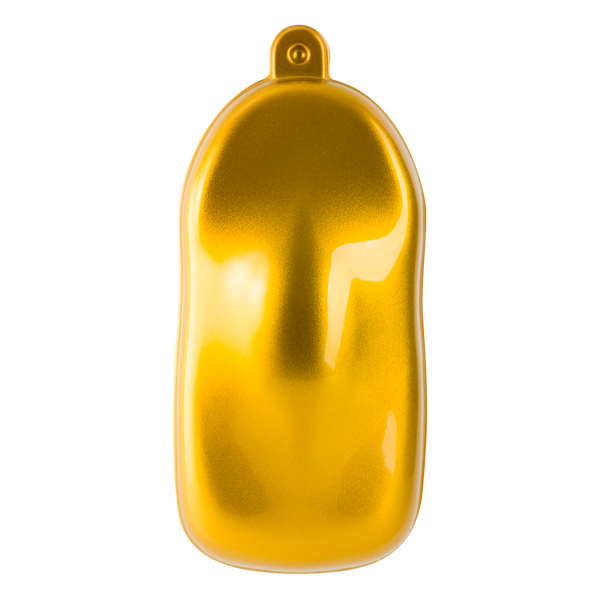
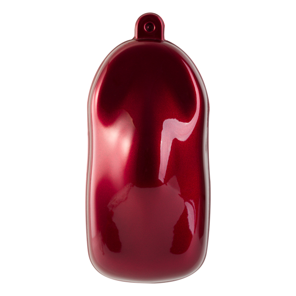
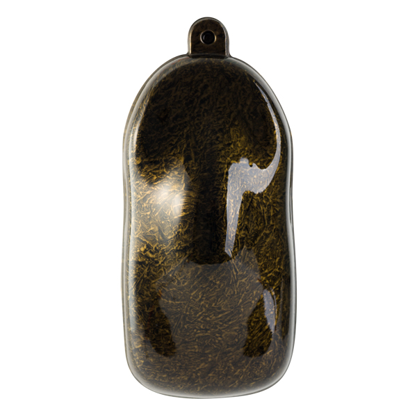
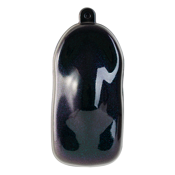
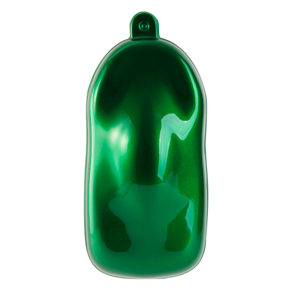
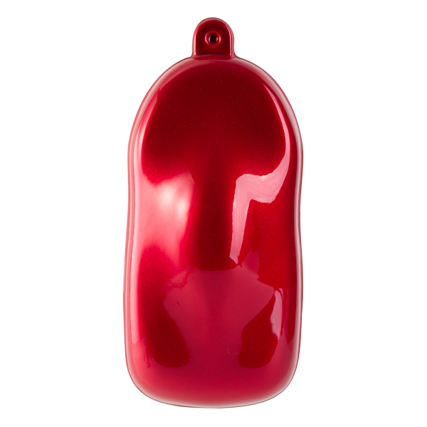
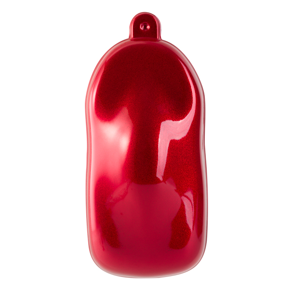
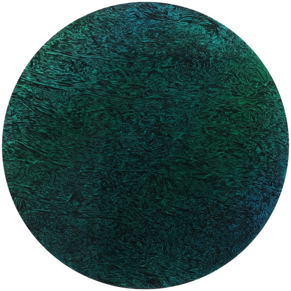
Apart from the use of the finishes the other really important thing to accurately portray to the customer through photography is the colour of these finishes. Although natural lit shots and phone camera shots play their part in social media, without the correct lighting and colour correction the important pigments and flakes in these finishes simply won’t be picked up.

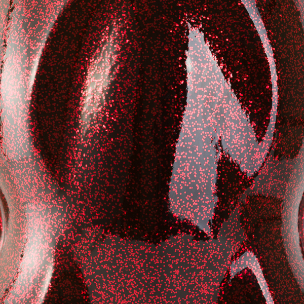
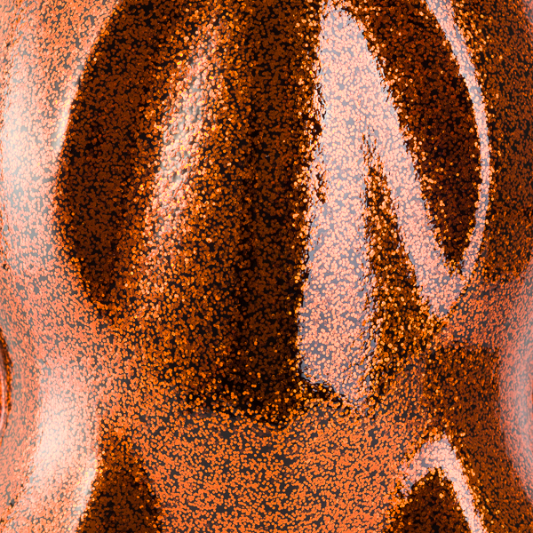
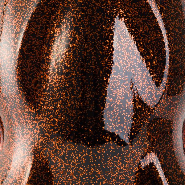
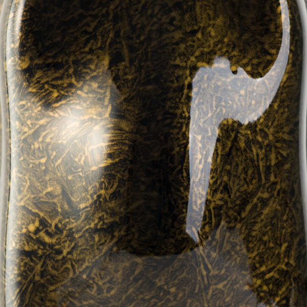
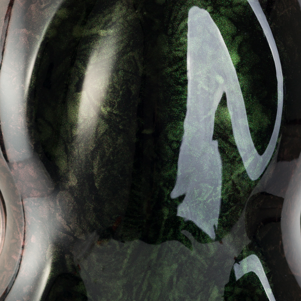
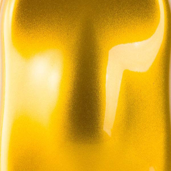
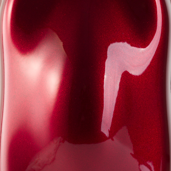
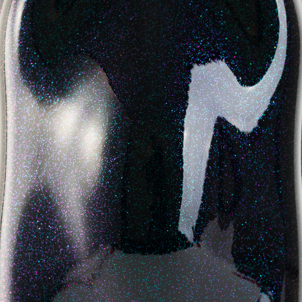
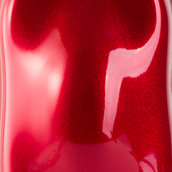
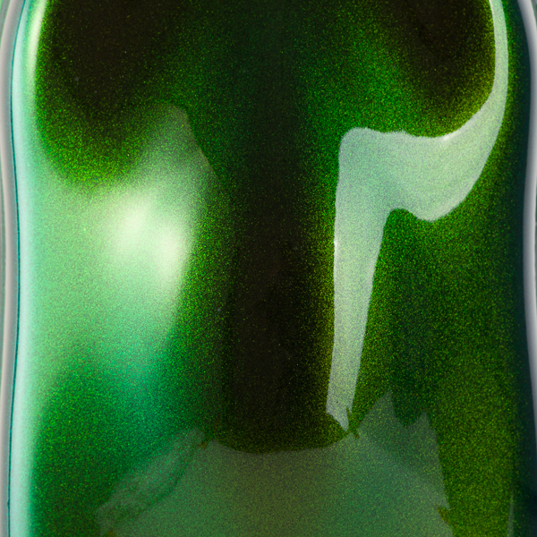
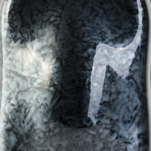
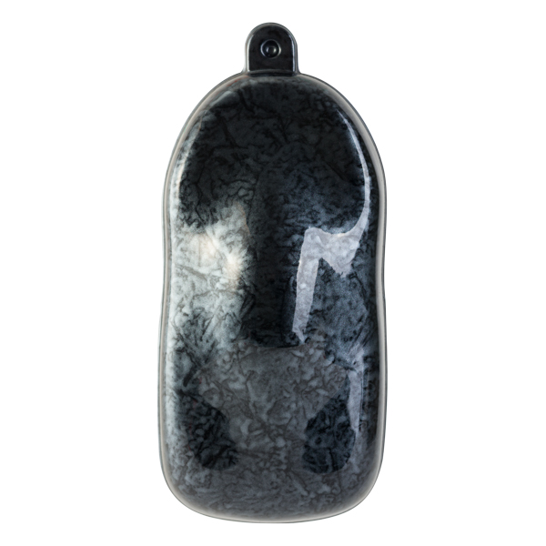
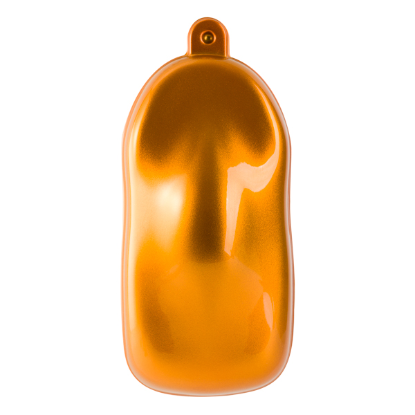
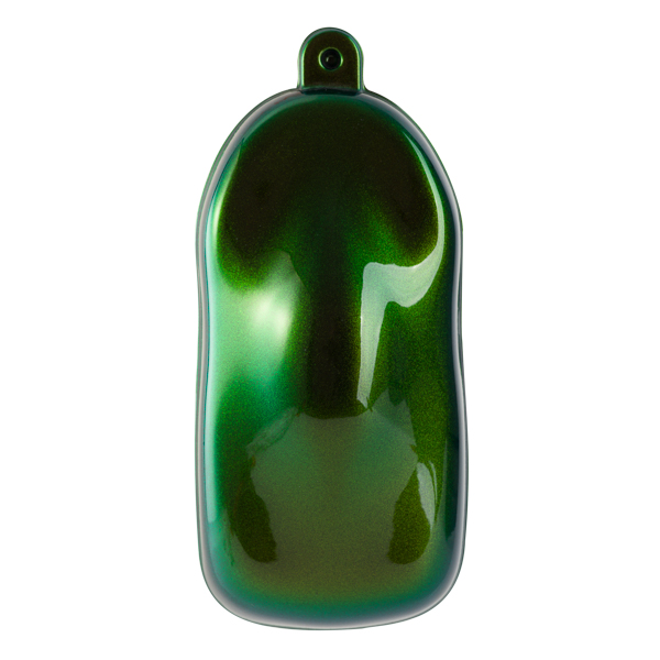
To move away from the automotive sector we decided to photograph a base selection of finishes on speedshapes, these are small moulds that look a bit like a car body but have different curves so that light will reflect off it in different ways. By cropping these square we are then able to hide the fact it looks like the shape of a car and end up with a nice colour swatch instead.

It was needed to link the imagery to a Call to Action on the website, therefore some shots of the speedshapes were taken from the side. This was then combined to a header shape image to allow space for copy.

Header Images Call to Action

The second day of shooting was about photographing table tops with various paint finishes applied, there was also a motorcycle helmet and tank to be photographed in remembrance of a fallen friend.

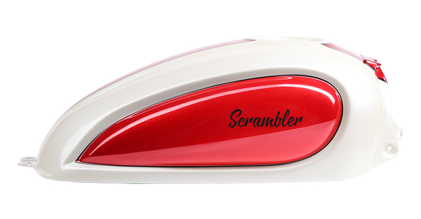
The motorcycle helmet shot was then combined with a closer detail of the paint to create a second header call to action image.


I AM NOT Putnam Seating! This is just a blog post about photography and design I did for them. Putnam Seating has now CLOSED DOWN.

In January I met up with Putnam Seating’s owner Mike Rossi, Mike has recently taken over Putnam Seating near Tower Bridge in London and is working on a major re-brand overhaul. Putnam Seating’s speciality is to supply re-trimming services for London Black Cabs as well as offering coach-trimming for all sorts of vehicles. It is a great service that they offer to the busy drivers as can swap out the seats whilst you wait and enjoy a quick refreshment break.

After a short chat about Mike’s business it was established that he needed some new imagery for his website and perhaps a few images for a flyer. I took a look at his website to establish what he needed as he is not working with a Creative Director, therefore I get to wear this hat too. Most of the imagery being used was from stock websites and has been overused so I suggested a few concepts below to help him visualise what we should be doing:

Hero Image before made it look like a taxi hire firm:

Conceptual Ideas:

With the main part of his business being about the interior re-trimming of taxi’s I felt it was important to come up with a concept that showed as much of this as possible. Shooting wide like this will allow viewing of panelling, floor and seats. The “Who We Are” section needed to be more personal, either a nice environmental portrait, team image or photo showing the interior of the workshop would be a lot more personal.

The second concept was to show some detail of the re-trimming, I wanted to see the stitching and the Exclusive Putnam Seat.

*Please note these images are not re-trimming by Putnam or photos by me, they are purely to illustrate a concept and photography rights remain that of the original owners.

What the final Hero Images look like:

This is the first hero image and as you can see the first thing the client sees now when they log onto the website is the main exclusive product and the detailed quality of the product. The “WHO WE ARE” image has been changed to a crop of the front of the unit so that clients can see the relation of the unit to The Shard and have a visual point to look out for when trying to find the facility.

All of the hero images have been carefully thought out to leave enough negative space for overset text and to allow cropping at the top and bottom to form a letterbox type crop.

A similar image to this one was used previously from stock but this shows the machines that are actually used and the hands of the owner.

Mike is very proud of how the studio now looks following his take over, he has worked really hard to make it neat, tidy and efficient. This in turn has created a nicer working environment and an area that is great to show off to his clients, it was therefore important to show this on his website. Whilst I was there it was a good idea to shoot a variety of hero images that could be used, below you will find a collection of those I created:

Content Imagery & Leaflet Design:

The next set of imagery to create was that for use in content and a potential flyer. I asked Mike to send me a copy of the proposed flyer design so that I could plan the images I needed to take based on the design. This is what he sent to me:

My initial thoughts:

When looking at the design for the first time the first question I asked myself was “If I didn’t know who or what this company was, what would I think they are?” I asked the opinions of another 4 people within the office too, conclusively everyone thought that it was a flyer for a private hire firm despite the logo saying “Seating” and “Coach-trimmers to the taxi trade”. What stood out the most was the big taxi, although this is relevant to the product it isn’t taxi services that are being offered.

What do they sell? Re-trimmed taxi seats and their Exclusive Putnam Seat.
Is this apparent? No.
Why is the leaflet orange, is it stood in a big rack of leaflets? No. It is handed out direct to drivers at taxi ranks.
So why is it orange? Orange is part of the companies branding colours and relates to their website.
Will the imagery look professional if cut out and put on an orange background? No. It would be better to use orange for titles and keywords, this will then match with the branding and make it easier to include product photography photographed on a white background.

Bearing in mind my quick analysis I decided it was best to suggest a new design idea, making the product the hero and not the colour. Having done some work with design in the past and understanding the good use of imagery I suggested the following design concept. (images for illustration purposes only).

Here you can see the front page has now been changed to a close up of one of their main exclusive seats, this shows the product and quality and now shouts what the company is actually about. The phone number and website are nice and prominent making it easy for drivers to find contact details. This design was based on the original content but has since been changed to concentrate purely on the taxi trade. To make it easy to find the unit a map has been included on the back with opening times and the boat image will be changed to an interior shot of the studio. Orange has been used for title areas and certain wording has been changed to sound more polite.

The inside of the leaflet will showcase one of the main seats in the centre making it the centre of attention and detail shots of the rear cushions will go on the right side. I was unsure of what to put into the seat and panel sections so for now put a Before and After in place, this could be changed to a detail shot of a fitted piece at a later date. Mike loved the new design idea and now it gave some direction of the images that needed shooting on shoot day.

Leaflet Results:

This is the final result of the leaflet, the Seat and Panel pictures still need changing as a taxi wasn’t available on the day of the shoot, the leaflet is not needed until the end of March so there is still time to get a taxi in to complete the imagery. Below is a selection of other content imagery I took on the day, there are a few textures of materials that are used which act as great background images for content sections:

Newspaper Advert Design:

Following the success of the imagery Mike suggested that he would like to run an advert in one of two industry publications aimed at the cabbie. Mike sent me a series of advert sizes which was great, but I needed him to work out what size he was going for. Print ad campaigns tend to work better if you run them every month/week over a period of time (3-6 months), without this repetition people rarely remember the ad and do not have a visual reminder of something they were planning to look into. With this in mind I told Mike to work out his overall budget for the campaign and divide that by 3-6 months. Once this was worked it was decided for us to go with a half page advert in The Badge.

Turn-around time:

Photoshoot on Friday 27th January, proof deadline Monday 30th January, printed on Friday 3rd February. That was some turn-around so I did work the weekend to get all the imagery and designs made, completed and signed off.

It needed to be bold, have quick impact and include all the information Mike wanted to squeeze in including a Twitter handle (that’s right, cabbies are currently mad for Twitter). After some playing around we came up with the following advert that shows off his 2 exclusive seats:

How quickly was the whole project done from concept to completion?

I made initial contact with Mike on the 23rd January, we discussed his ideas, his plans for the company and how we can work together. I asked Mike to send me a few snaps of the products and his studio and we worked on concepts via email from there. We arranged the photoshoot for the 27th January and I had completed retouching and designing everything by the 29th January. On Monday the 30th January I uploaded some of the imagery direct onto his website so it was ready for his web designer to use. All the files were transferred to the relevant people electronically so were available immediately. Total time: 7 days.

To learn more about Putnam Seating visit www.putnamseating.co.uk 


RWB UK Trailer

Currently I am working on a short documentary showing the build of the first Rauh-Welt Begriff 964 Porsche 911 build in the UK. RWB is run by Japanese car designer Nakai-San, he creates wide arch body kits for Porsche’s and tailors the cars ride to that of the driver.

In the last year alone Nakai-San has built over 60 RWB’s across the world, his designs are now so famous that they are used in The Need for Speed video games. This 964 is the first to sport the Royale wide arches and Fender wings and is also one of the first to have a sound system.

The full feature is expected to be 20-30 mins in length and will be released late in 2016. For now I hope you enjoy this 36 second teaser. To keep updated on the progress follow my social sites which are available at the top of the page.


Privacy Settings
We use cookies to enhance your experience while using our website. If you are using our Services via a browser you can restrict, block or remove cookies through your web browser settings. We also use content and scripts from third parties that may use tracking technologies. You can selectively provide your consent below to allow such third party embeds. For complete information about the cookies we use, data we collect and how we process them, please check our Privacy Policy
Youtube
Consent to display content from - Youtube
Vimeo
Consent to display content from - Vimeo
Google Maps
Consent to display content from - Google